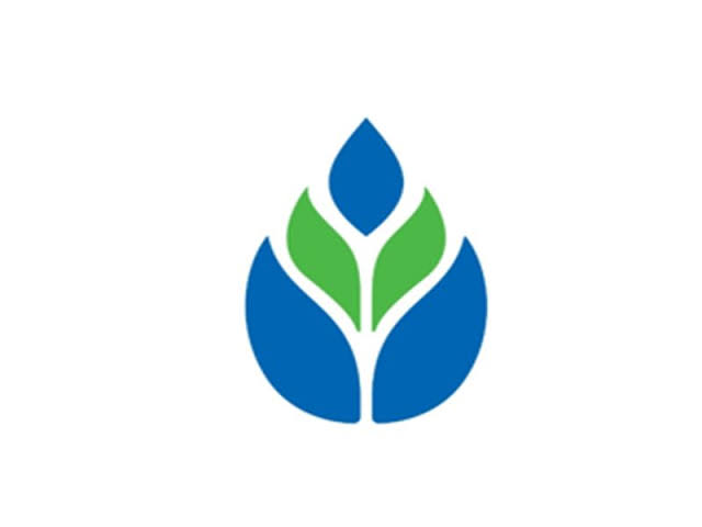
 Logo Symbolism: Progress, Nurture, and Enlightenment
The new logo has been carefully designed to embody the core values of RRBs. Its elements include:
- Upward Arrow (Progress): Signifies growth, development, and advancement in rural economies.
- Hands (Nurture): Represents care, support, and a helping hand to rural communities.
- Flame (Enlightenment): Symbolizes knowledge, empowerment, and spreading financial awareness.
The chosen colors further reinforce the objectives of RRBs: dark blue represents finance and trust, while green symbolizes life, growth, and the mission to serve rural India.
Strengthening a Unified Brand Identity
The introduction of a single logo is expected to give RRBs a distinct, modern, and easily recognizable brand presence nationwide. It reflects their commitment to progress, financial inclusion, and rural empowerment, strengthening visibility and credibility in the communities they serve.
This common branding initiative is a key step in the post-amalgamation phase, ensuring that RRBs present a cohesive identity while continuing to support the government’s broader rural development and financial literacy goals.
Commitment to Rural Development
By unifying their visual identity, RRBs aim to signal stability, trust, and a shared mission to promote sustainable economic growth in rural India. The new logo is designed not only to inspire confidence but also to reinforce RRBs’ role as a catalyst for progress, nurturing communities, and spreading financial awareness across the country.